I was happy to see that you are constantly working on the software. I never thought that, as a software developer, I’d be on the other side for once and get to test a beta version. So here goes.
1.
I found a bug:
I’m on one of my products, scroll down to the reviews, and I’m shown reviews from other products.
2.
I don’t think it’s so good that all the product description details have to be clicked individually. It’s important that at least the first item is visible right away. Because I’m afraid that, for example, I write there that you need to be able to read a crochet chart, and people buy it and are disappointed that they didn’t know that.
So the general product description should be visible right away.
3..
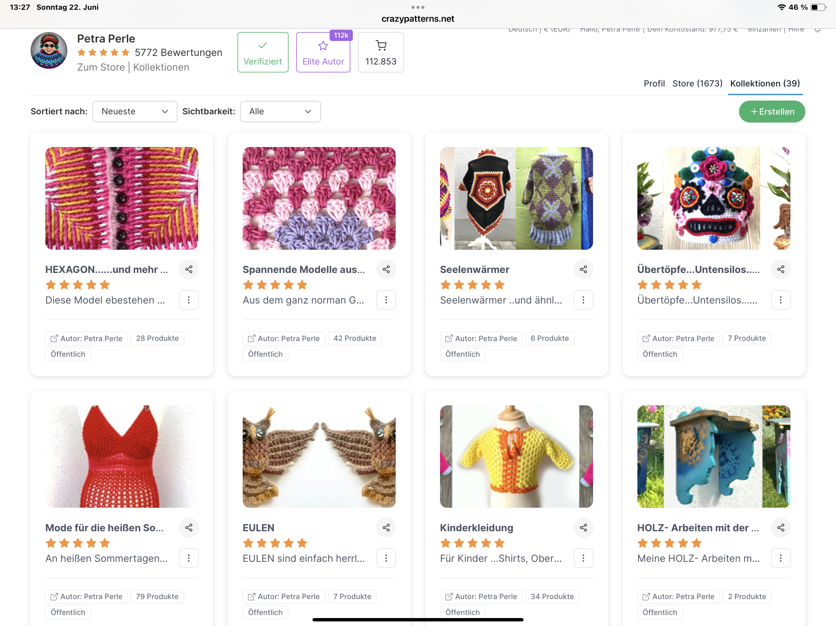
When I’m on the right under the product statistics at collections, it only says “Knitting” there. I don’t have any collections, but why Knitting then?
4.
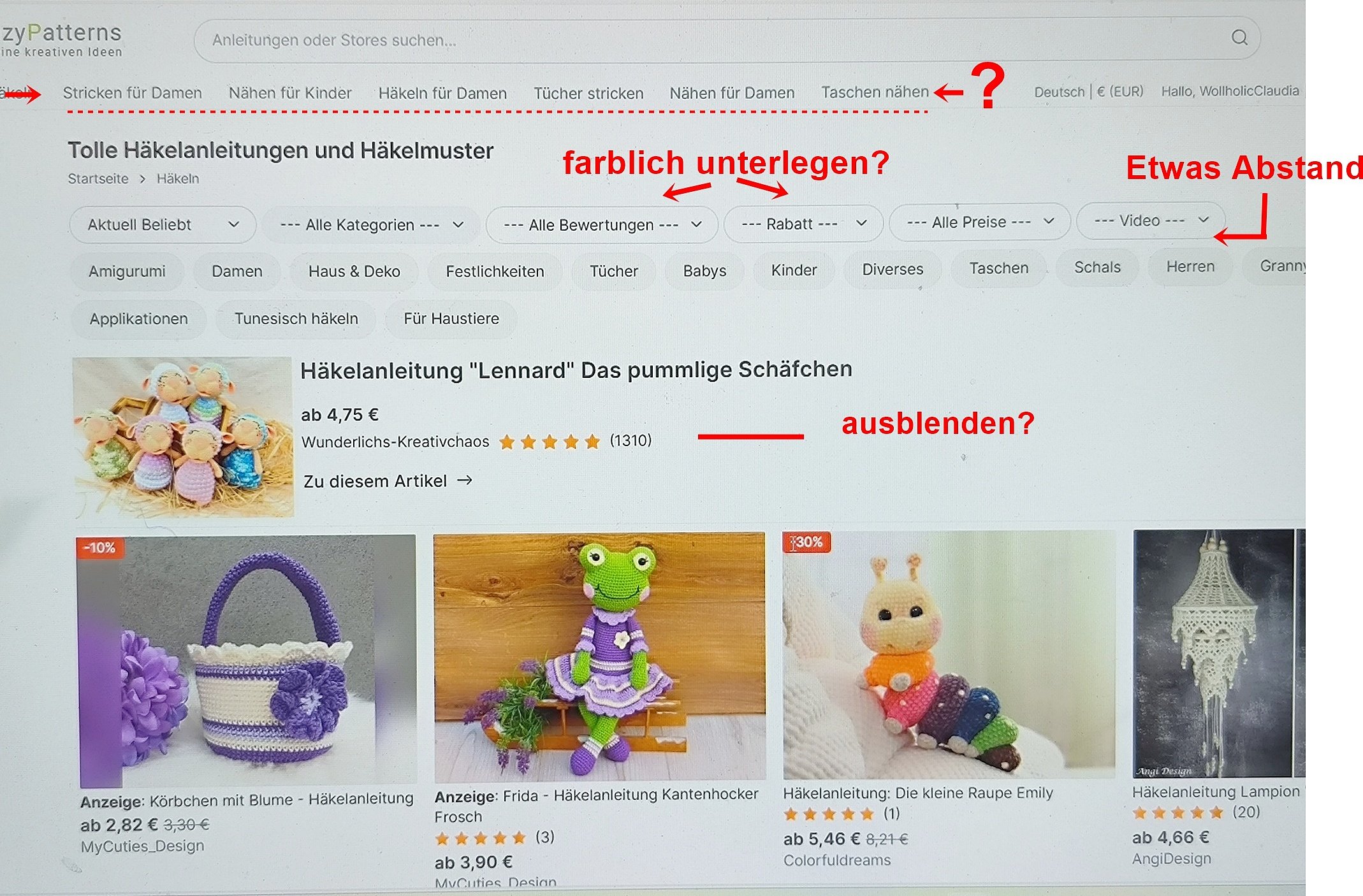
When I have clicked on a product, there are only 8 selection options left at the top, so for example crochet amigurumi is there, crochet for women too, knit shawls, but not crochet in general or crochet for men.
Only these appear at the top in the display:
Crochet amigurumiKnitting for womenSewing for childrenCrochet for womenKnit shawlsSewing for womenSew bagsFelted crochet
5.
The section “Ask a question” (formerly comments) is too tempting for people to ask a question. I’m afraid people will then just ask first, e.g. can I crochet this in size XXL too? instead of reading the text first, especially since it doesn’t appear right away (see point 2 of my criticism)
So please change it back to “Comment”
6.
How do you get back to the homepage quickly (from a product view)?
Okay, you can find it, but it should be right at the top, where only those 8 mentioned above in point 4 are.
7..
I think after making a selection, too few items are shown in the view. You have to click “next page” far too often. That’s annoying. Why not show 100 at once?
8.
When showing my patterns, the first view shows these columns
№ Date Price OP Discount Ø #
but it was better before. Now I first have to click “View” to get what I need as a designer:
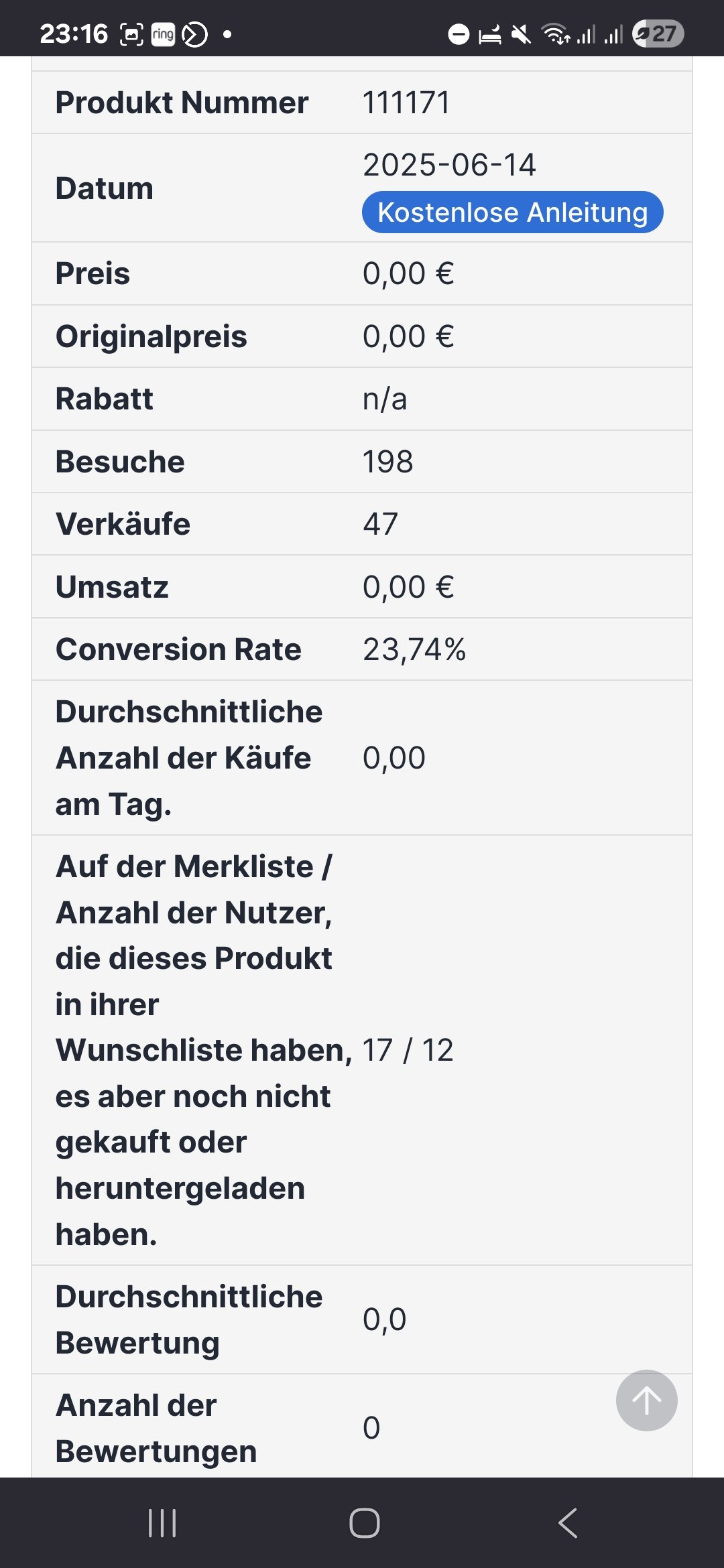
№ Date Price OP Discount Visits Sales Revenue CR DSØ WL Ø #
Please make this view the initial view
9.
About the homepage:
I don’t think the images for the individual categories (Everything for your DIY project) are well chosen. Are they constant, or do they change?
Whoever appears under the 8 images in “Trends and recommendations” is really lucky. I think it was better to show lots of small images. So the user doesn’t have to “work” first to see more. I’m afraid that if there’s nothing good among the 8, they’ll leave CP again.
So—now I’ll stop and keep looking.